Project Setup
Meeting the Team
This project was a collaboration between HackNY, OpenAQ, and St. Mary's County as part of HackNY's Social Good Initiative for its summer fellows, a program that seeks to pair skilled programmers with non-profit organizations in need of volunteer technical assistance. Fellows were given a half dozen possible projects to work on, and told to rank them in order of personal interest and desired role (product manager or developer). I was matched with OpenAQ, an organization that seeks to improve public access to live and historical air quality data. I was one component of a 3-person team, with myself as the project manager, and Vinay Bahip / Kingsley Szeto as developers.
Talking to Stakeholders
First on the list of Stakeholders was OpenAQ, who I reached out to set up an introductory video call in which they could meet the team and we could start a conversation about project goals and timeline. We met with Dan Gorelick, a HackNY alumnus himself and developer with OpenAQ. Together we determined that we should work on a new dashboard design and implementation for their Breathe Well collaboration with St. Mary's County. The specifics of the design process was left open to us, though Dan gave us some requirements passed on from St. Mary's County Health Department:
- Map with colored flags to give live AQ categories
- Each school should have one flag associated with it, averaged from between 1-4 sensors
- Live measurements of each individual sensor should be shown after clicking on flag
- Ability to be embedded on St. Mary's website in iframes with weird aspect ratios
UX Design Process
Market Research
We started the UX design process with a review of different air quality visualization websites to examine how they handle interactively displaying aqi data. When examining their designs, we had a specific eye towards how they made the data accessible and easily understandable to a casual viewer.
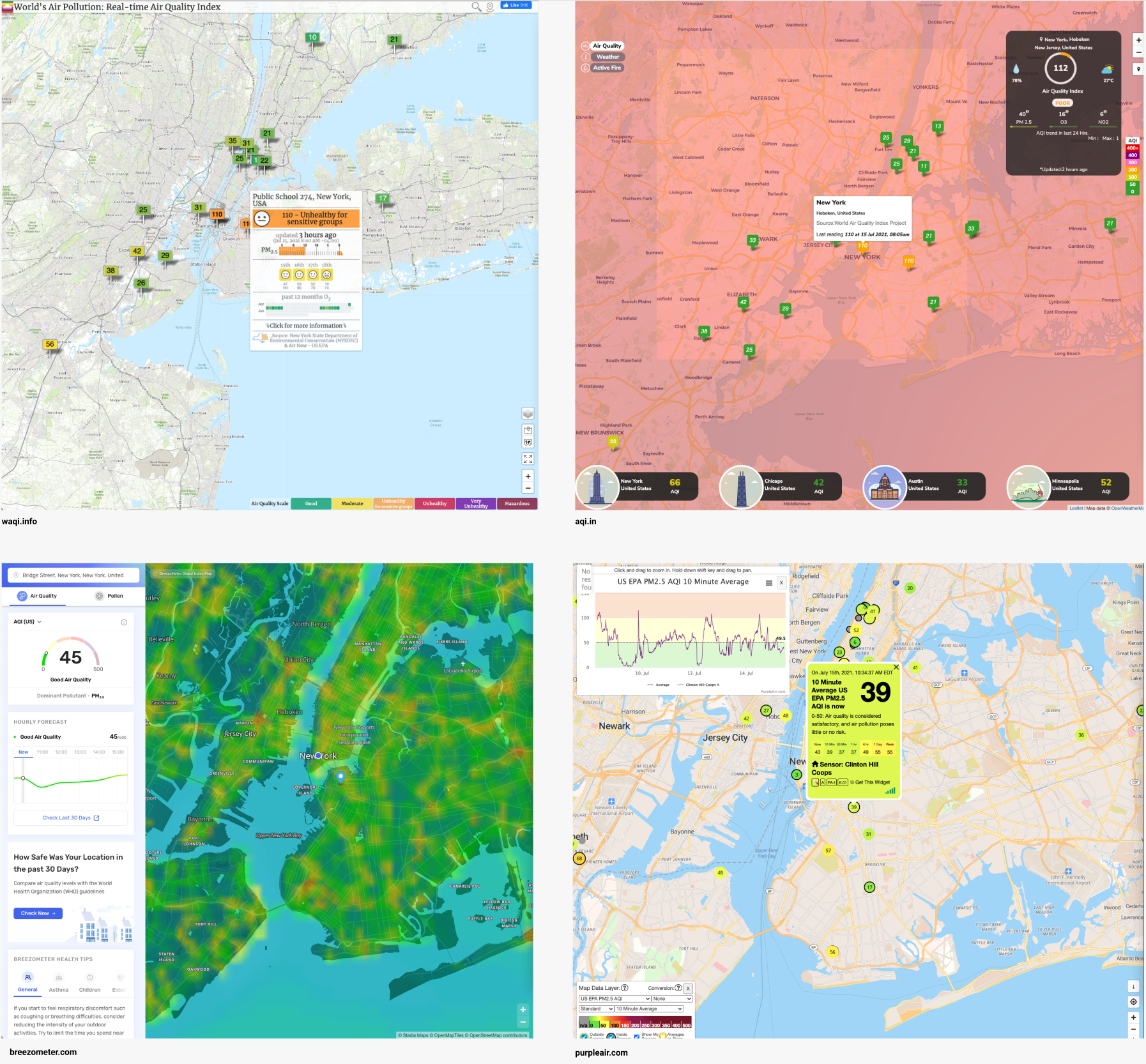
There were a few significant takeaways we noted from this analysis:
- The colored, numbered sensor flags are a very common interface paradigm and work well for pinpointing sensors close to the user
- We preferred the easy-to-digest sensor popup of waqi.info over the cleaner interface of PurpleAir
- AQI map overlays (lower left/upper right) seem to be more difficult to digest and less precise then we expected
User Interviews
At this point in the process I'd typically want to start conducting user interviews, but unfortunately we weren't be able to get the school district to connect us with the students and teachers themselves during summer break. So instead we reached out to our high school AP Environmental Science teachers and asked about what they think would be most helpful to both the educators and the students. Combined with a separate meeting with St. Mary's School District administrators, we laid out these additional considerations and features:
- Interface needs to both be understandable by students in elementary school and be a powerful learning tool for students in AP Enviro
- It's currently quite difficult for teachers to access the air quality data in a CSV form that they can manipulate
- Teachers are planning to integrate physical geography lessons with the air quality lessons, so a satellite map might be very useful
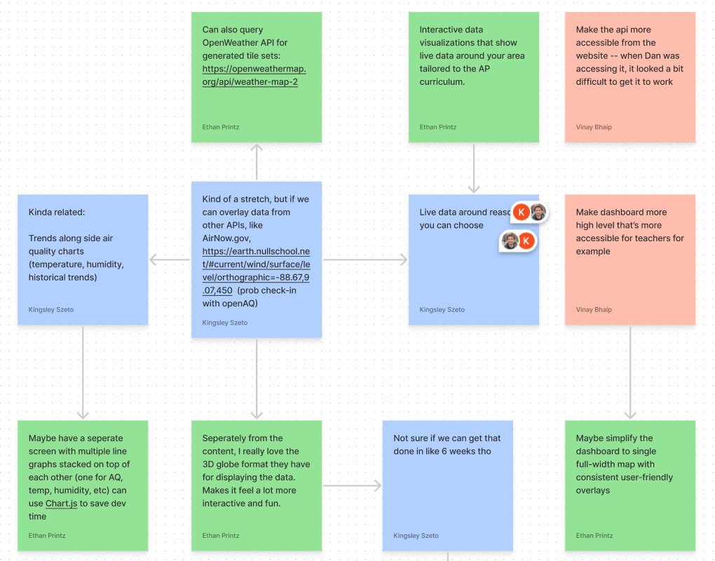
Product Brainstorm
For the next step in the process, I moved the group to a shared asynchronous brainstorm document in Figma. This project was done part-time in addition to our actual internships and other HackNY events, so finding consistent times to meet was difficult. Here we could share ideas, proposals, and questions with each other in a traditional whiteboard and post-it style format. We spent a couple days asynchronously updating this session whenever we happened across an idea. This is a section of that brainstorm document:
Prototype Design
For the final step in the initial design sprint, I worked with my team to put together a high-fidelity prototype of our proposed new dashboard in Figma. I tried to aim for a visual style that was simultaneously friendly, welcoming, and information-heavy. It should be approachable to 3rd graders and still interesting to 12th graders. This goal led to the creation of a style with rounded corners, bold colors, and typography that is playful yet readable.
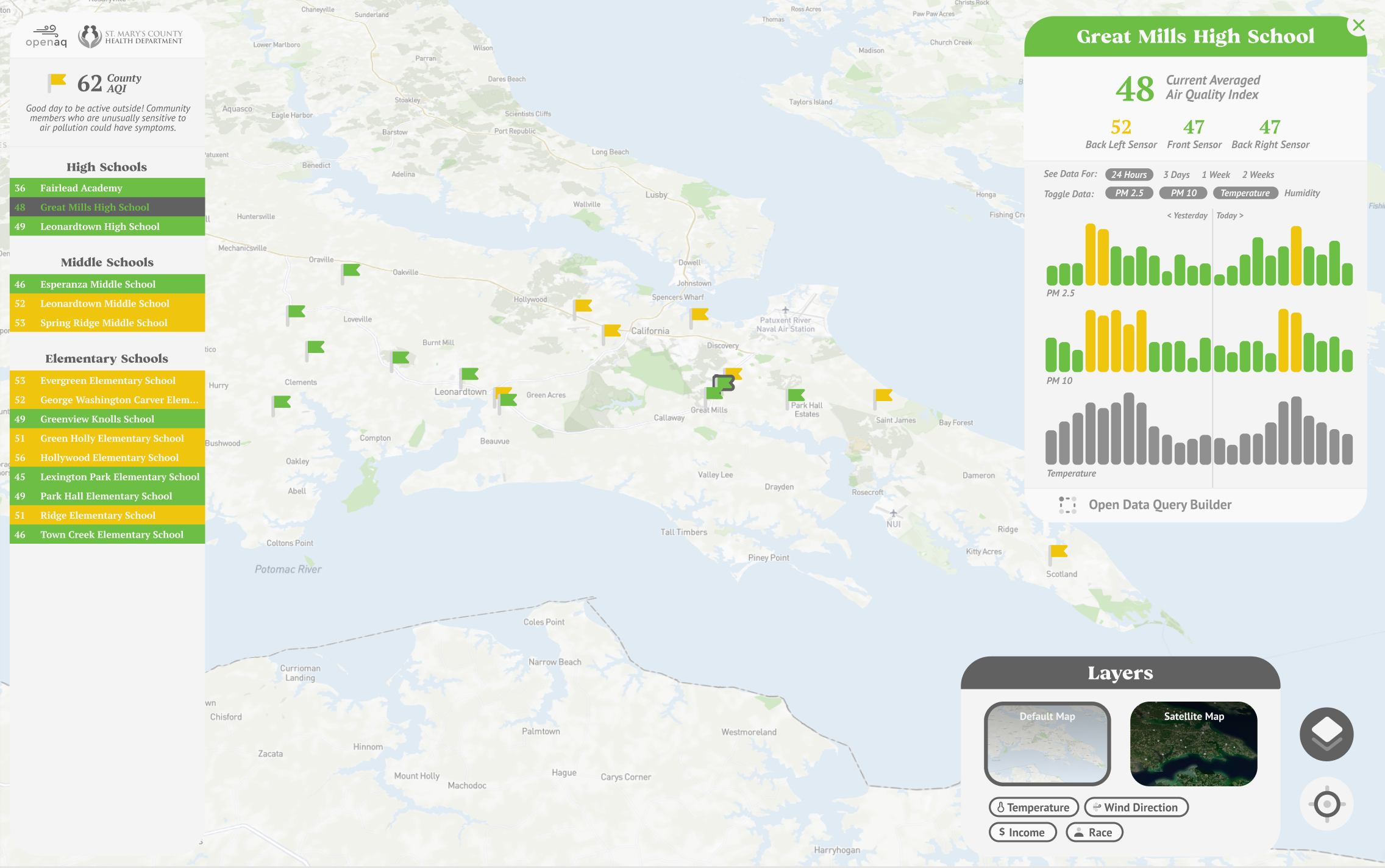
On the left hand side I arranged a column with each of the schools in the district so that students who aren't as familiar with the local geography can click directly on the name of their school. The map style was customized to feel approachable and have a focus on the natural features of the local area. We also designed an option to toggle between a vector map and a satellite map, as when we were looking through some of the teachers' lesson plans we noticed that some of them were planning to have students cross reference images from Google Earth and figured we could bake that functionality directly into the app itself. On the right hand side is a popup which shows the most important information on the page: graphs that visualize the PM2.5 and PM10 readings over time, as well as the current readings themselves. There's also the data query builder accessible at the bottom of the popup, which allows students and teachers to download specific parts of the datasets as a easy-to-manipulate CSV file.
Development Process
Choosing a Tech Stack
The choice of tech stack was quite easy for this project, as all three of us possessed a shared professional skillset in React. Most of the time spent on this step was determining specific libraries and hosting platforms. Mapbox was chosen as our mapping platform over various OpenStreetMap-based libraries, as it was determined to be more user friendly, customizable, and we would come in under the free usage limits anyway. Netlify was decided as our hosting platform, as it was a static site service we were all comfortable with and that again we'd come in under the free limits. As we were working with OpenAQ on this project, naturally we'd be using their API to retrieve air quality data to populate the interface.
Dividing the Workload
As PM, I set up a Trello board to keep track of all of the asynchronous development work we'd be doing. I discussed with both of my other team members which parts of the site they felt most excited about developing, and it just so happened to work out that we could divide the workload into three distinct parts that we were all excited to work on:
- Kingsley: Data Visualization Screen
- Vinay: Data Query Builder Screen
- Ethan: Map, Left Panel, and Integration
Development
For our three separate areas of development, I divided the work up into 6 main components: LeftCol, Map, RightModal, and MapControls. Within RightModal was DataViewer (created by Kingsley) and CSVModal (created by Vinay). Because of this containerization, we were able to work asynchronously without spending an extensive amount of time working through Git merges.
The map itself was a pretty simple affair. I decided to use the react-map-gl library which sits atop the vanilla javascript implementation of mapbox-gl-js and allows for me to use React hooks and virtual DOM without losing much functionality or performance. The flags are mapped from an array of sensor data that was queried on page load and passed into the component. One major consideration was constraining the flag re-rendering within a useMemo hook to prevent it from re-drawing itself too often and diminishing performance.
import React, { useState } from 'react';
import styled from 'styled-components';
import MapGL from 'react-map-gl';
import Flag from './Flag';
import 'mapbox-gl/dist/mapbox-gl.css';

function Map({ combinedData, setSelectedSchoolID, selectedSchoolID, mapType }) {
  const [viewport, setViewport] = useState({
    latitude: 38.21499,
    longitude: -76.534533,
    zoom: 10.62,
    bearing: 10.18,
    pitch: 56.05,
  });

  const mapStyles = [
    {
      name: 'classic',
      uri: 'mapbox://styles/ethanprintz/ckr59in1c17s017o7ep66ebi0',
    },
    {
      name: 'satellite',
      uri: 'mapbox://styles/ethanprintz/ckr6eno400vlt17pohba9l6af',
    },
  ];

  const flags = React.useMemo(
    () =>
      combinedData.map((school, i) => {
        return (
          <Flag
            key={i}
            lat={school.lat}
            long={school.long}
            aqi={school.liveAQI}
            schoolCode={school.id}
            setSelectedSchoolID={setSelectedSchoolID}
            selectedSchoolID={selectedSchoolID}
          />
        );
      }),
    [combinedData, selectedSchoolID, setSelectedSchoolID]
  );

  return (
    <Container>
      <MapGL
        {...viewport}
        width="100vw"
        height="100vh"
        mapStyle={mapStyles.find((style) => style.name === mapType)?.uri}
        onViewportChange={setViewport}
        mapboxApiAccessToken={process.env.MAPBOX_ACCESS_TOKEN}
        ayncRender={true}
      >
        {flags}
      </MapGL>
    </Container>
  );
}

const Container = styled.div`
  position: absolute;
  top: 0;
  left: 0;
  width: 100vw;
  height: 100vh;
`;

export default Map;
One of the most ambitious components of our proposal was the display of historical AQI data in both the graph visualizations and the data query builder. OpenAQ themselves weren't sure if their API was flexible enough to deliver it, as it'd have to be queried from a separate difficult-to-use archive system. In the end, we were able to figure out how to query a CSV from their servers and dissect it into the data that we'd need to display.
// Query sensor data - RightModal/CSVModal/index.jsx
 const parameters = [];
      parameters.push(`location=${sensor}`);
      selectedAirFactors.forEach((airFactor) => {
        parameters.push(`parameter=${airFactor}`);
      });
      parameters.push(`date_from=${selectedFirstDate}`);
      parameters.push(`date_to=${selectedLastDate}`);

      queries.push(`${BASE_URL}${parameters.join("&")}`);
    });

    submitAPICalls(queries, selectedAirFactors).then((sensorAverages) => {
      exportAsCSV(sensorAverages);
      setDownloading(false);
    });

// ...

// Receive sensor data - utils/getSensorData.js
export const getSensorDataByURL = (url) => {
  const response = fetch(url)
    .then((res) => res.text())
    .then((csv) => readString(csv))
    .catch((err) => console.log(err));

  response.then((arr) => {
    const sensorData = arr.data.slice(1);
    let readings = [];
    const data = sensorData.slice(1);
    data.forEach((reading) => {
      const utcTimestamp = reading[4];
      const readingType = reading[6];
      const readingValue = reading[7];

      if (readings.some((r) => r.utc === utcTimestamp)) {
        readings[readings.findIndex((r) => r.utc === utcTimestamp)][
          readingType
        ] = readingValue;
      } else {
        readings.push({
          utc: utcTimestamp,
          [readingType]: readingValue,
        });
      }
    });

    return {
      locationId: sensorData[1][0],
      locationString: sensorData[1][1],
      latitude: sensorData[1][9],
      longitutde: sensorData[1][10],
      readings,
    };
  });
};
Deployment
The site is currently deployed publicly on Netlify, and has been used by thousands of students, teachers, and citizens across the district to monitor local air quality and learn more about the environment.