Wikipedia Explore
As a weekly assignment for my UX Design Class, we were given a partner and told to design a novel frontend interface for Wikipedia with the prescribed goal of increasing exploration/discovery. After quite a bit of ideation, my partner Grace and I decided that it would be interesting to find a way to visually manifest the 'Wikipedia Rabbit Hole' phenomena.
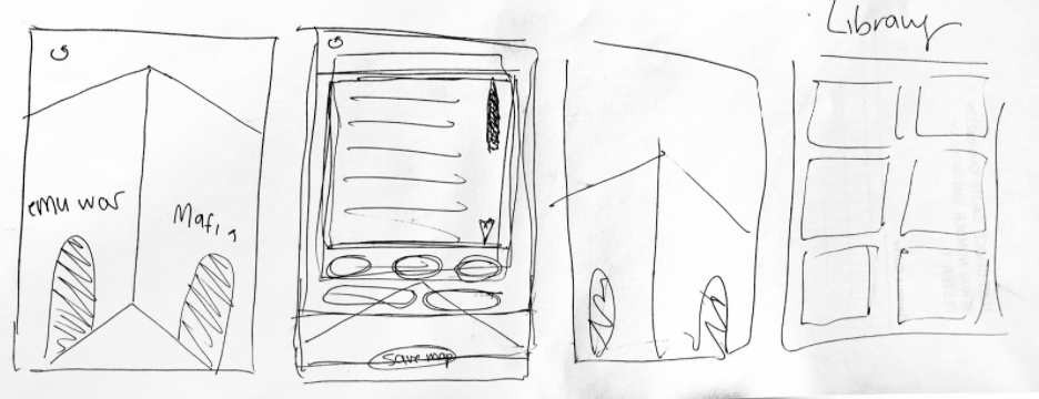
We initially envisioned a mobile app centered around data boxes/modules. You’d start at a random article and lines would appear if you clicked on a related article. At the end you could save your data cluster and move through it whenever you want to see how the different articles you read connect to each other.

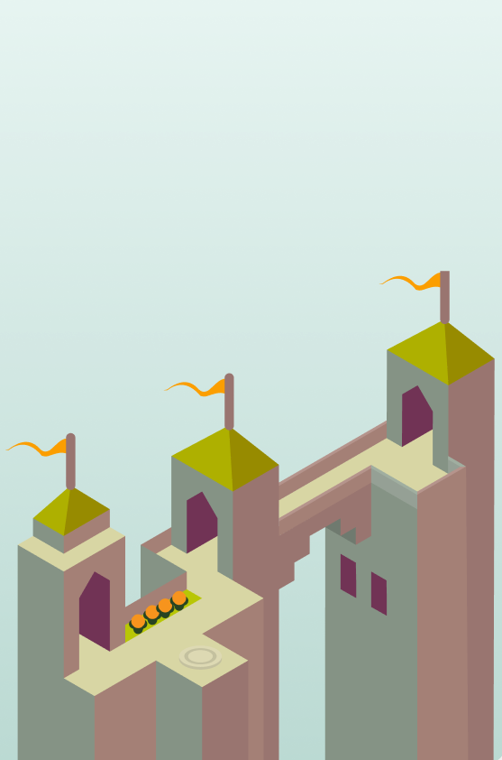
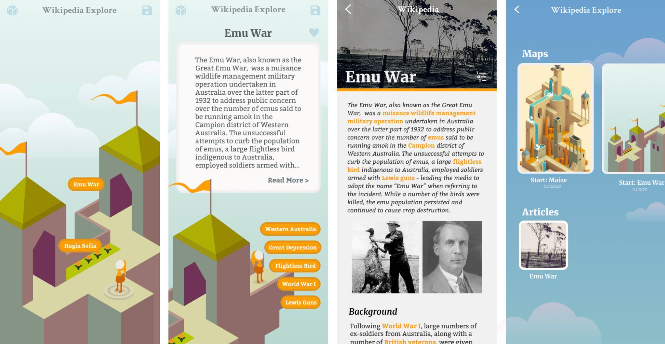
We decided to move away from our earlier prototype (top) to a more visually interesting 3D view. Aesthetically inspired by monument valley , we envisioned a network of knowledge, explored by the user over time, could become fully realized as a beautiful castle of knowledge (bottom).

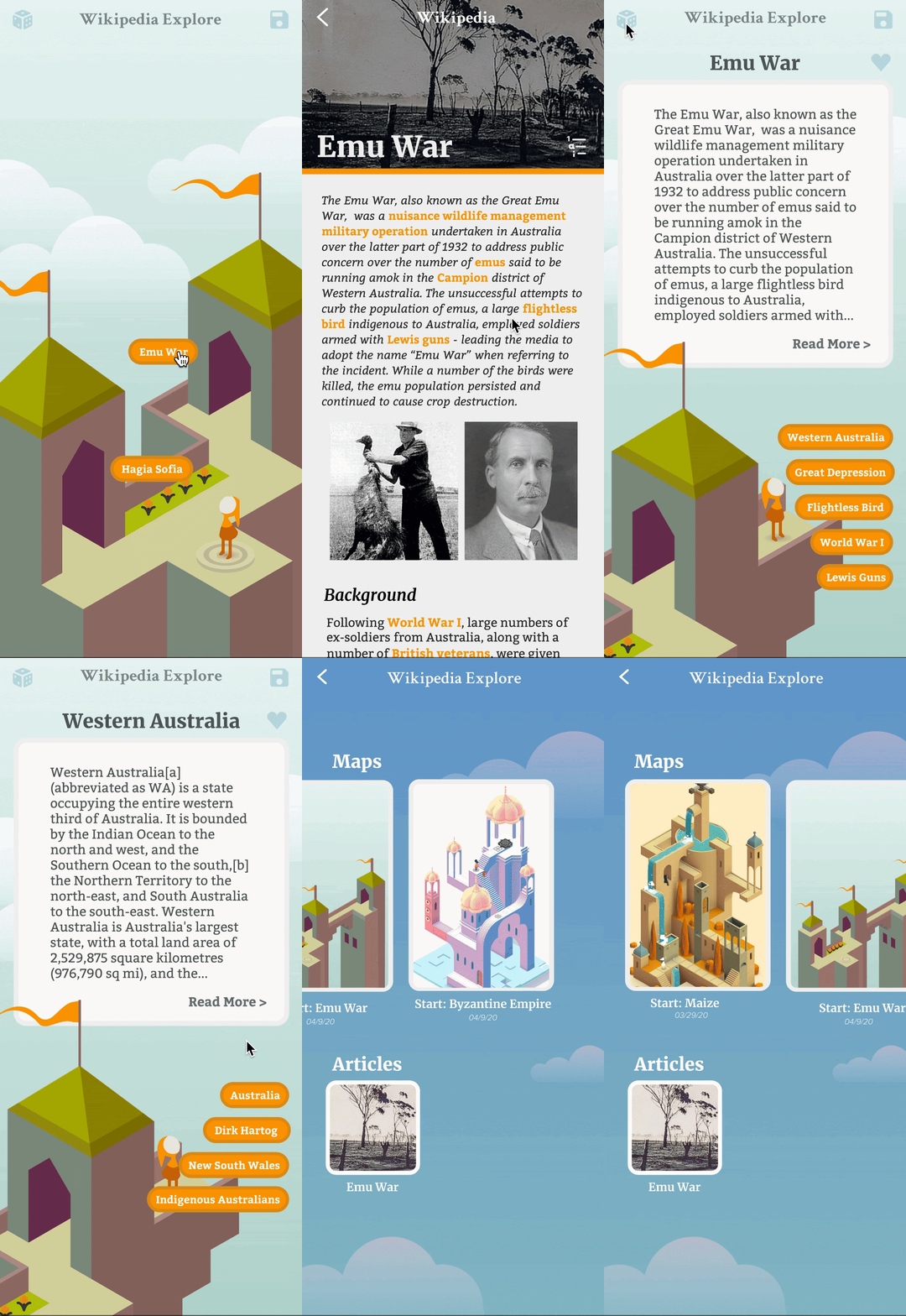
It uses the metaphor of a building to show the user that different topics are connected, in this case by bridges.The user is first given two randomly generated Wikipedia articles. If they’re not interested in either, they can reload. If they are, they select the article and begin their journey. They are shown a snippet of the article and want to, they can tap the article to read the whole thing. Alternately, they can save the article for later reading. Once they exit the full article, they can click on one of the related article tags below their original article if they’re interested in any of the topics. Doing so creates a new bridge and castle, sending them to a new Wikipedia page.

At the end, the user has created a beautiful castle. They can later explore a 3D model of their castle and see their thought process visualized. They can also save their favorite articles for rereading.
Our goal was to present Wikipedia as a fun, whimsical and spontaneous experience that was simultaneously joyful, memorable and constantly evolving to avoid user boredom. Wikipedia is often seen as being dull and boring, as it’s an online encyclopedia. We wanted to combat this by both gameifying and beautifying the experience.
